Writing used to move faster than visuals in my workflow.
I could outline an article, tighten the argument, and get the CTA right, then lose half the momentum the moment I had to leave Obsidian to create images. Prompting, variant review, naming, exports, crop checks, and final embeds all happened in different places. The writing loop was fast. The visual loop was sticky.
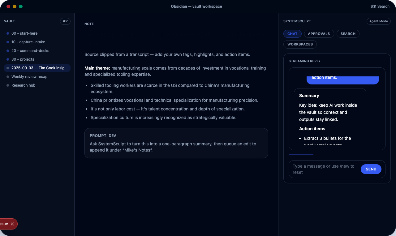
That was the reason I added image generation directly into SystemSculpt.
Why I wanted image generation inside the vault
I do my best work when the operating context stays tight.
For content, that means the note, the prompt, the image outputs, and the publish artifact should all live close to each other. The moment asset production moves into a separate tool maze, the workflow starts shedding clarity:
- prompts drift because they are not versioned with the note
- approved assets end up in random folders
- embeds break because naming gets sloppy
- visual choices stop matching the actual page goal
Keeping image generation in Obsidian solves more than convenience. It keeps the production system coherent.
The part most people underestimate is asset role
Before I generate anything, I decide what job the image has to do.
That sounds obvious, but it is where most prompt quality is won or lost.
I am usually generating one of four roles:
- a hero image for the main promise of the page
- a supporting visual for a specific section
- a social card or distribution asset
- a conversion-support graphic that reinforces the CTA
Once the role is clear, prompt decisions get easier. Composition, ratio, focal point, and detail level all follow from the role. Without that constraint, prompts become descriptive but directionless.
The production loop I actually run
My loop is small enough to repeat.
First, I define the asset role in the note.
Second, I generate one concept set with controlled variation. I usually want three to five variants, not twenty. Too many options slow down review and blur the decision.
Third, I run a hard quality gate. I am checking for legibility, crop resilience, style fit, and whether the image helps the page instead of just decorating it.
Fourth, I save the approved asset to a deterministic path and embed it immediately in Markdown. That immediate embed matters. It catches bad crops and context mismatches while the choice is still fresh.
This is the same reason I like stable slugs and versioned folders. Predictable paths make the workflow easier to maintain later.
The prompt framework that keeps output consistent
I do not think good image prompting comes from ever-longer paragraphs.
What helps more is a repeatable skeleton:
Create a <aspect-ratio> visual for <asset-role>.
Context: <topic + audience + conversion intent>.
Visual direction: <style anchors, composition, lighting>.
Constraints: no text overlay, strong focal point, web-safe contrast.
Return <N> variants with controlled composition differences.
The value of that structure is not elegance. It is repeatability.
I can reuse it across hero images, section visuals, and campaign assets while changing only the parameters that actually matter. That means less prompt drift and better visual consistency across a project.
If you want the setup path, the best next reads are the image generation docs and the SystemSculpt AI setup docs.
What usually goes wrong in image workflows
The first failure mode is over-generation. People make too many variants, then the review cost eats the time they thought they saved.
The second is prompt drift. A project starts with one visual direction and quietly becomes five unrelated styles because nobody locked the template.
The third is file chaos. Assets become hard to reuse because naming was improvised under deadline pressure.
The fourth is crop blindness. An image that looks good in one note can fail badly as a social card, blog slot, or mobile header.
And the fifth is conversion mismatch. A beautiful image can still be wrong for the page if it distracts from the action the page is trying to drive.
Those are workflow problems more than model problems. That is why I built the feature around generation plus review, not generation alone.
How I know an asset is good enough to ship
My quality gate is practical.
I want:
- one clear focal point
- composition that survives the intended crop
- no accidental text artifacts or muddy detail
- a visual style that matches the page intent
- a file path and name I will still understand later
If those are true, the asset is usually good enough to publish.
If they are not, I would rather rerun than carry a weak visual through the rest of the workflow. Weak images create the same kind of drag as weak intros in writing. They make the whole piece feel less resolved.
Definition of done before I call the workflow healthy
I consider the image workflow healthy when all of these are true:
- the approved asset is embedded in the note immediately
- the file path is stable and understandable without guesswork
- the image still works in its real destination slot
- I could recreate the result because the prompt structure is still legible
If one of those fails, the workflow is still leaking time somewhere.
Where this fits in the bigger SystemSculpt workflow
I think the feature is most useful when it is part of a larger production loop.
For self-serve operators, that means using SystemSculpt for Obsidian to keep writing, image generation, and approvals in one environment.
For teams treating content and media as part of a bigger governed workflow, the vault workflows guide is the useful starting point. It makes approvals, review points, and maintenance expectations explicit from the start.
I did not build image generation to make the app feel broader.
I built it because publish-ready visual work kept being the bottleneck after the words were already done.
If the rest of your workflow is fast and images are still the sticky part, that is exactly the gap this closes.